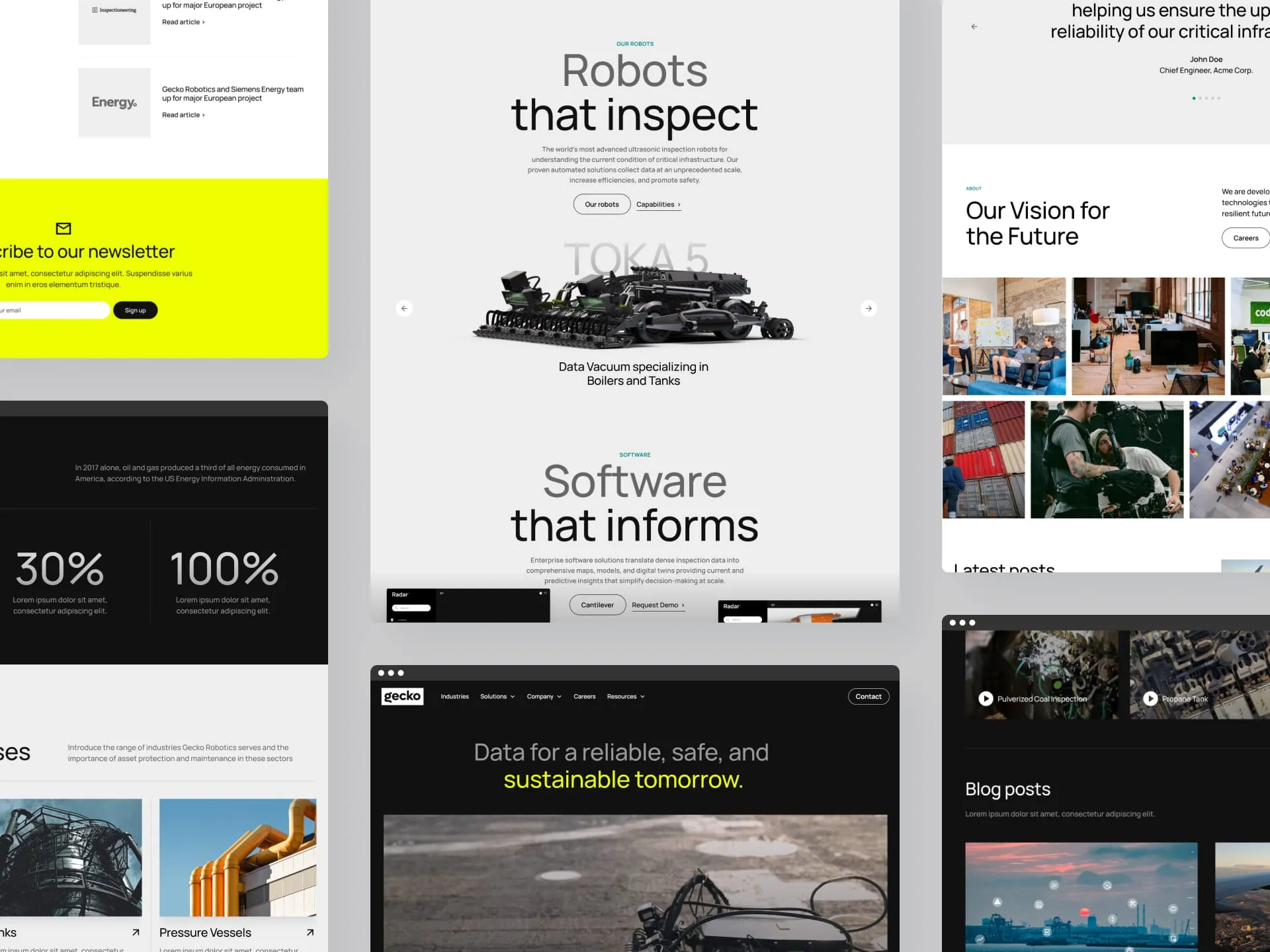


Some badass teams we've worked with

Digital Design

Bold, subtle, timeless, off-the-wall - we’ll bring your wildest (or tamest) visions to life.


Webflow development


Whether you need a page tune up or a full site refresh, you deserve a strong foundation that supports your future growth.
And much more
Contact us with your deepest desires (or just your project needs) and we’ll tell you all about our service smorgasbord.


Our work
Stunning websites made for wicked clients (the cool wicked, not fairy-tale-stepmother wicked).


Hey there,
I’m Félix Meens, founder of Webflix Studio. After spending more than 5 years in design and development across multiple tech companies, I founded this studio to do one thing: create astounding Webflow websites for badass marketing teams.
I am the lead designer and developer at Webflix, as well as the main point of contact on every project. When necessary, I bring in talented freelancers to solve your project needs. Our studio gives you the flexibility of working with a freelancer - rapid response times, personal communication, full focus - and combines that with agency-quality work. So you really get the best of both worlds.
My goal is that you feel that working with me is like working with a great colleague. You know, that person who knows the ropes, likes to have fun but also gets shit done at the same time. If that sounds good to you, I think we’d be a great fit.
- Félix Meens, founder of Webflix Studio

What our clients say about us


Interested in working together?


We have a feeling that this is the beginning of something wonderful. Send us an email with your project needs, and we’ll get back to you within 1-2 business days (probably sooner).


